Rebrand for the Research Project ALICIA CME
Project duration: March 2025 – October 2025
From March through October 2025, MWIMMERDESIGN developed a rebranding campaign for ALICIA CME – a European research project focused on the circular economy in manufacturing – that included a new logo, website, and explanatory video.
The project focuses on the reuse and digitization of production facilities in order to find a viable way to “close the loop.”
Client and Project
ALICIA CME is a transnational European research project on the circular economy in industrial manufacturing that focuses on extending the service life of manufacturing systems through reuse and digitalization to enable closed-loop product cycles.
MWIMMERDESIGN was tasked with modernizing the brand’s identity: redesigning the wordmark, developing a contemporary website, and conceptualizing and producing an explanatory video. The collaboration ran from March to October 2025.
Strategy
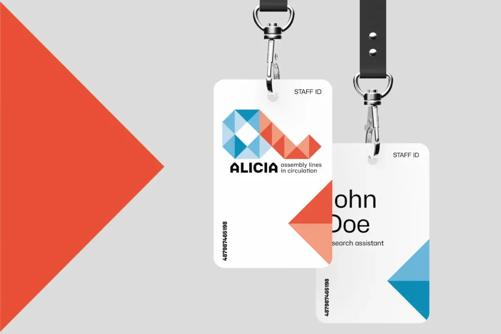
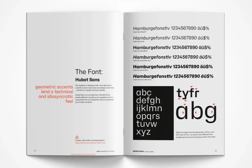
The logo was retained, but the color palette was optimized to include shades of red and blue to convey a sense of visual modernity. The geometric Hubot Sans typeface family was chosen as the brand typeface to create a technical look.
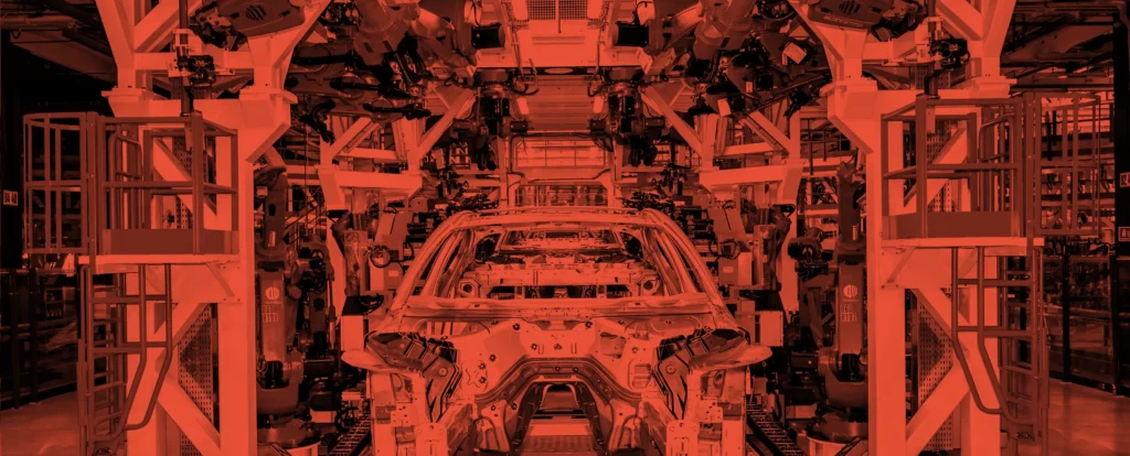
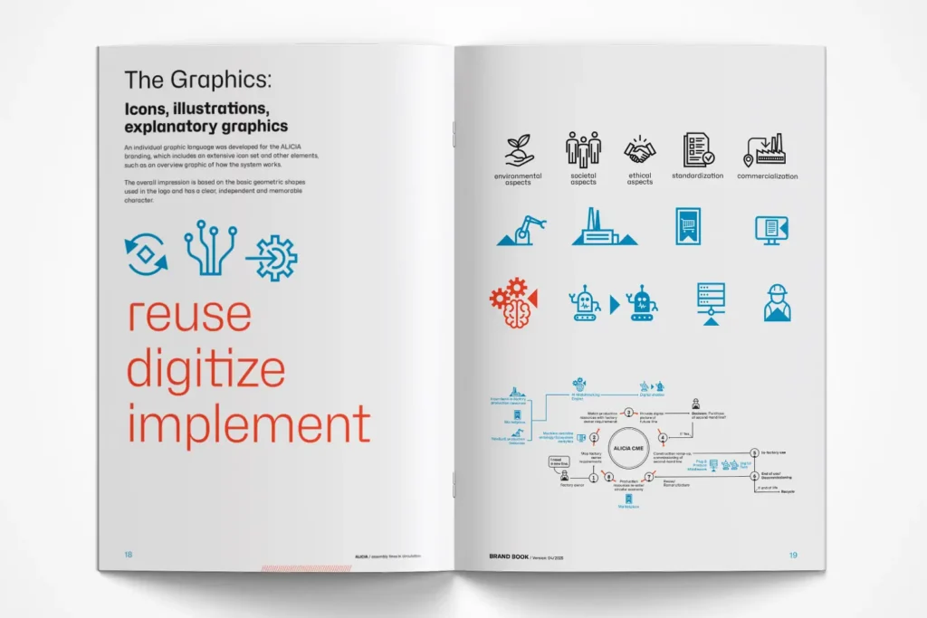
A distinct visual system featuring symbols and explanatory visuals echoes the logo’s geometric design language; the imagery focuses on production facilities, machinery, and project participants, primarily in high-contrast black and white.
Implementation
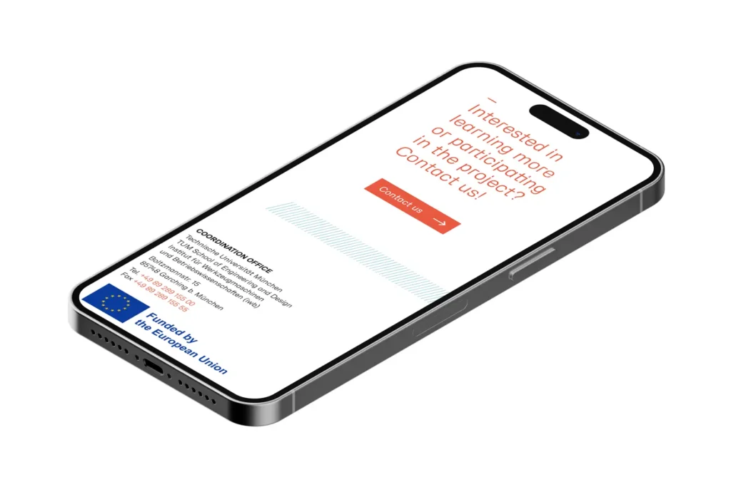
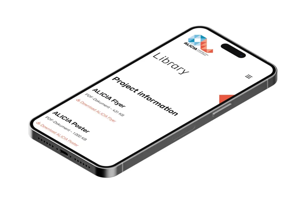
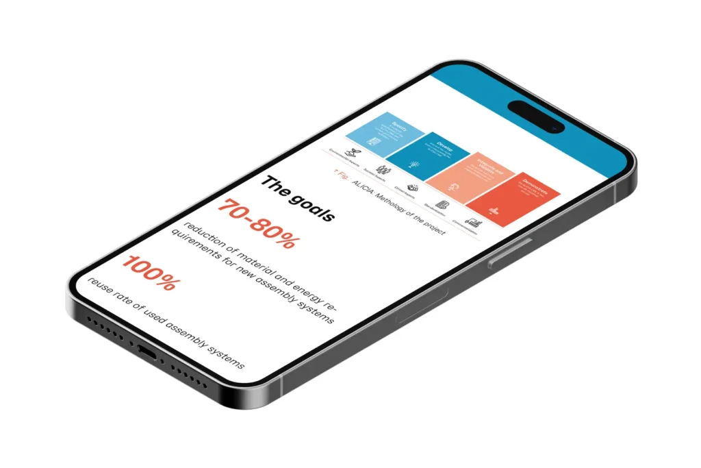
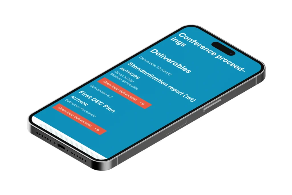
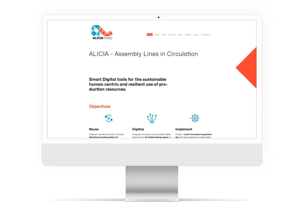
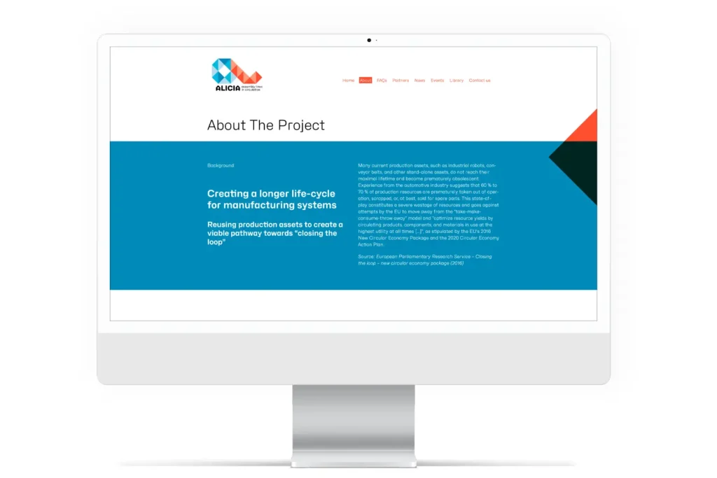
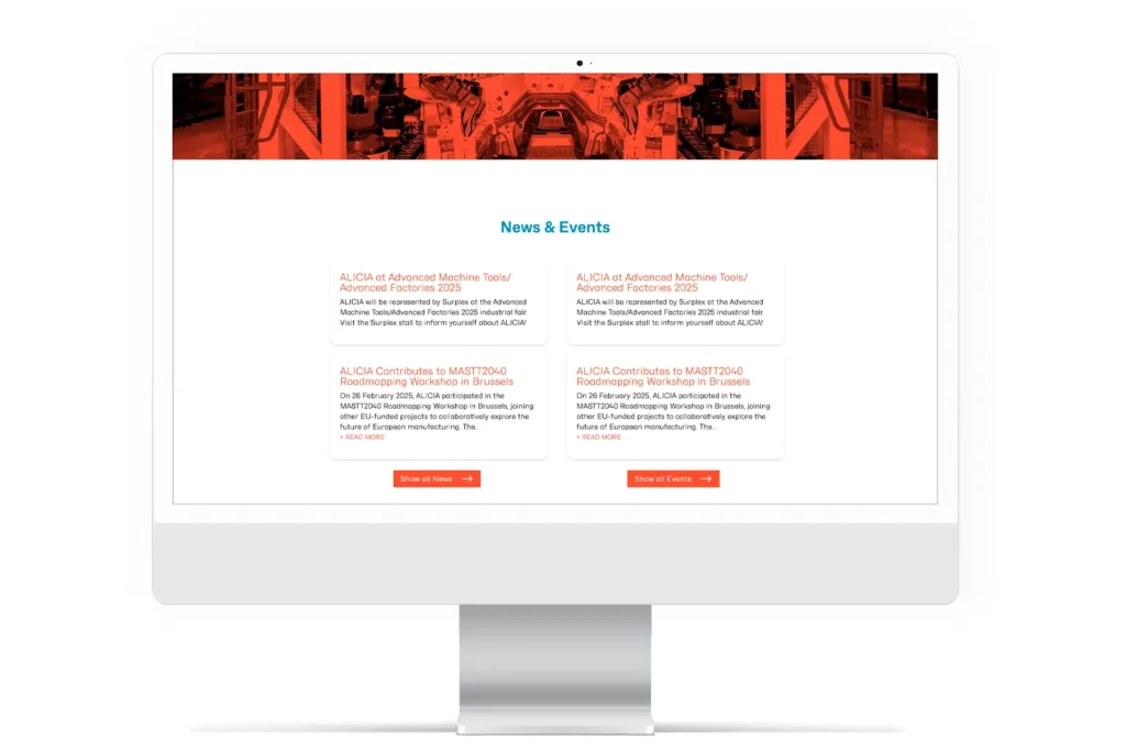
The redesigned website, developed for both mobile and desktop devices, consistently showcases the brand identity across the homepage, project information, and news section.
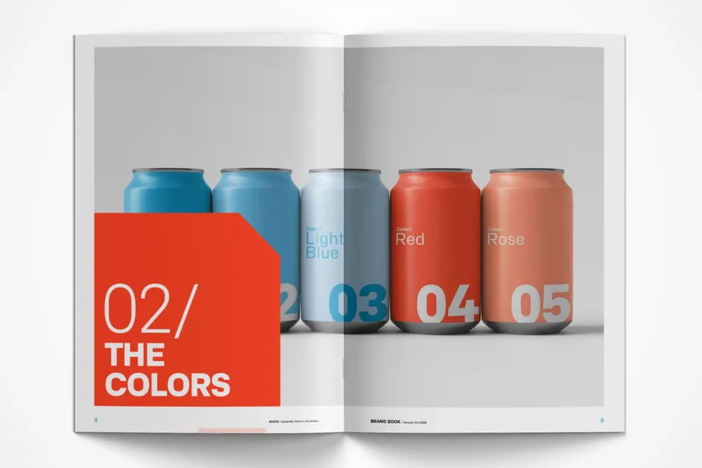
In addition, an explanatory video was produced that concisely illustrates how the research project works and its significance. A brand book documents the color palette, typeface system, graphic elements, and visual language, along with guidelines for future use.
The following were delivered:
New wordmark with a revised color scheme, graphic system featuring symbols and visuals, responsive website, explanatory video, and brand book.
Our Services in a Project Context
ALICIA – Rebranding
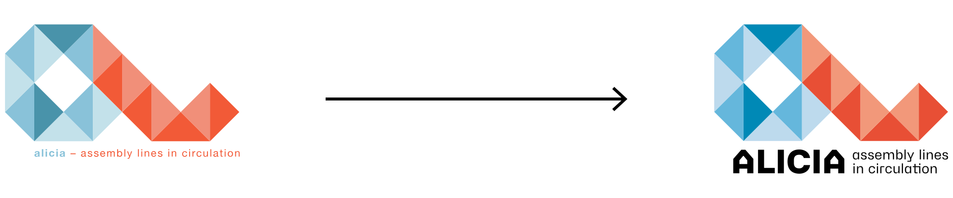
The Logo:
Geometric, clean, and versatile
During the redesign, the logo’s basic shape was retained; only the color scheme was slightly optimized, and the wordmark and tagline (ALICIA-Assembly Lines in Circulation) were redesigned and repositioned for better readability.

The Colors:
Primarily shades of red and blue
The color scheme for the ALICIA branding is derived from the logo colors. As part of the redesign, these colors were chosen to be slightly bolder and brighter. They reinforce the defined corporate identity with their modern, dynamic, and versatile effect, creating an appealing, vibrant overall look.
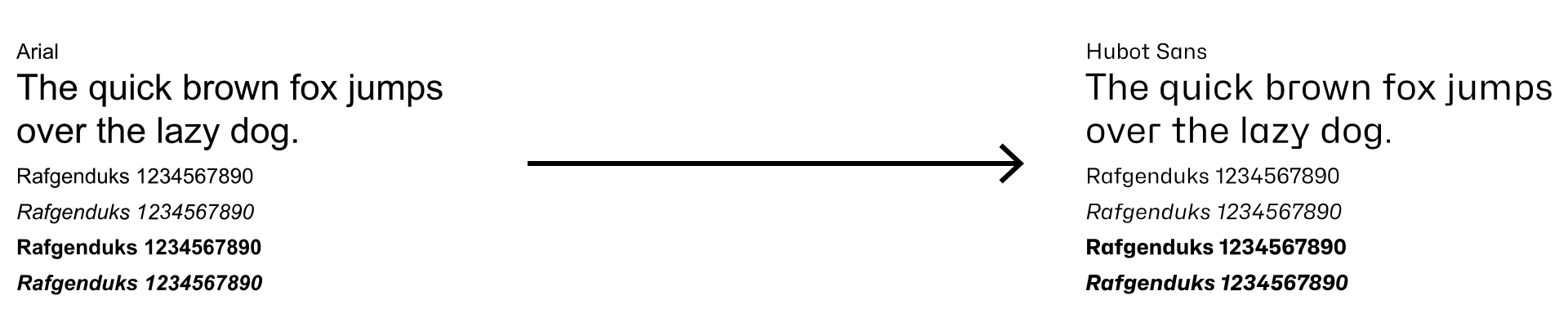
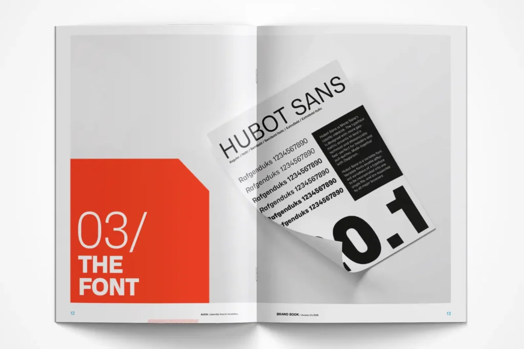
The Font:
Hubot Sans
The typeface features striking geometric accents designed to convey a technical and distinctive look—perfect for headlines and highlights. Hubot Sans is a variable font that allows different variations of a typeface to be integrated into a single file. These are supported by all major browsers.

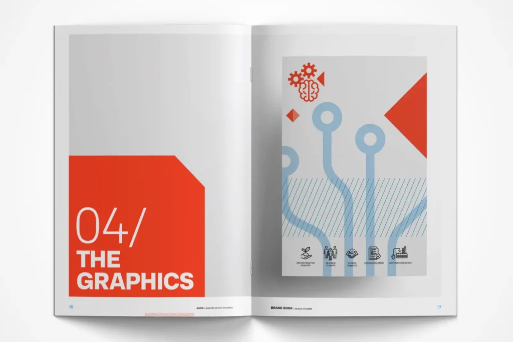
The graphics:
Icons, Illustrations, Explanatory Graphics
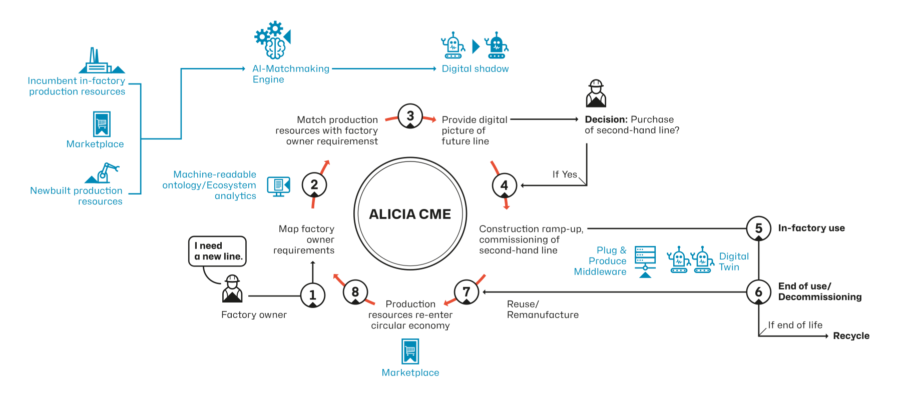
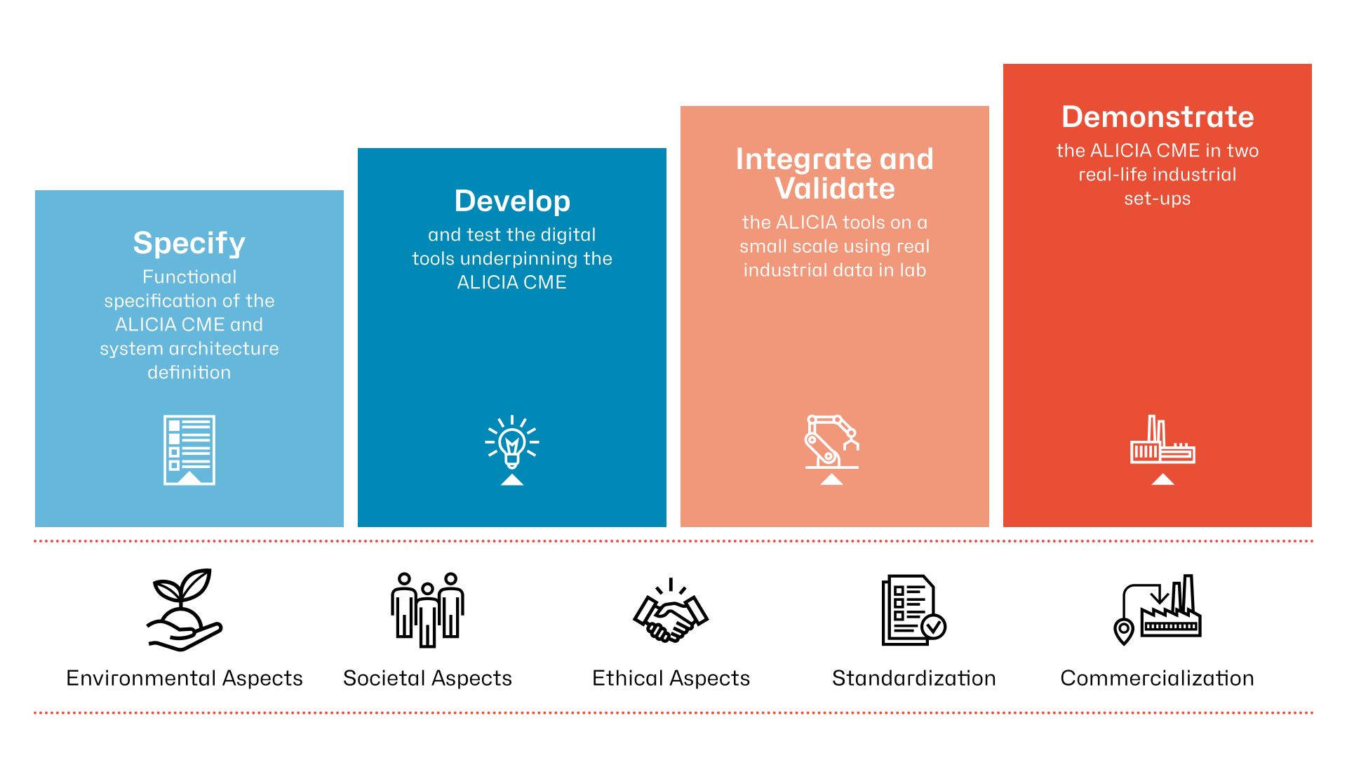
A unique graphic language was developed for the ALICIA brand, comprising an extensive set of icons and other elements, such as an overview graphic illustrating how the system works. The design of the graphics aligns with the basic geometric shapes used in the logo and has a clear, distinctive, and memorable character.
The Visual World:
Production Facilities, Machinery, and More …
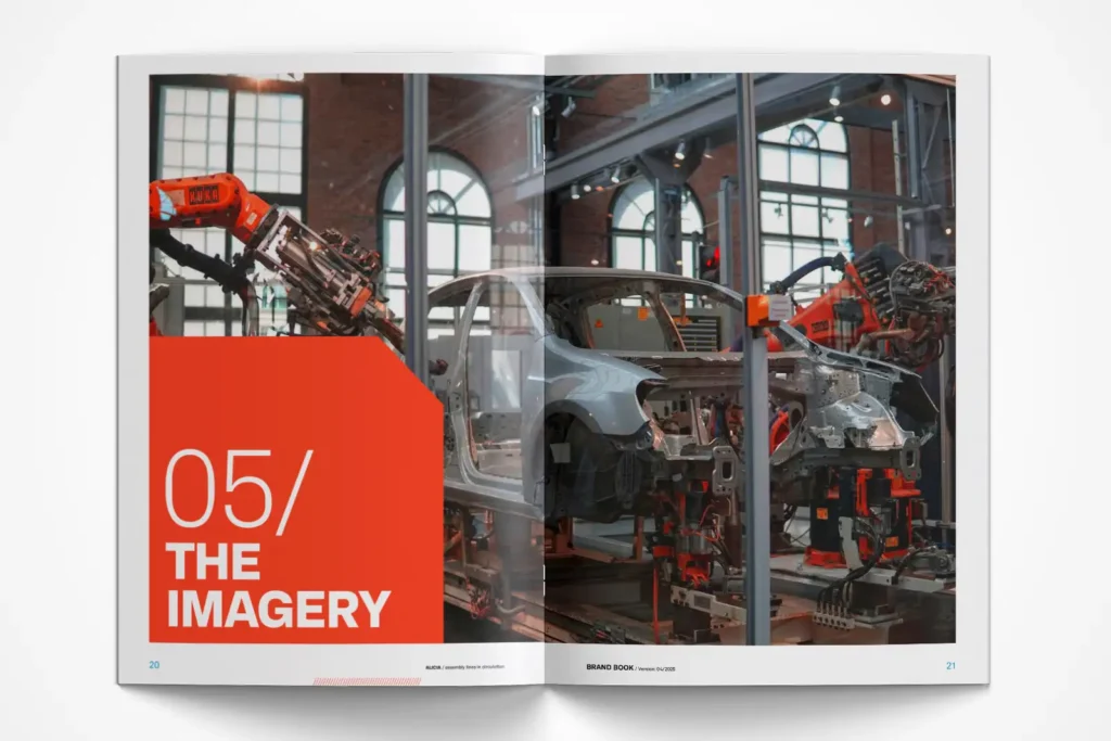
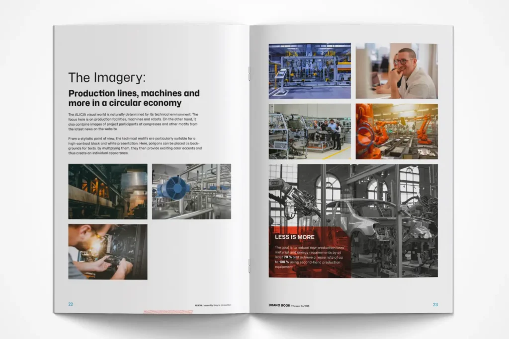
The ALICIA visual universe is naturally shaped by its technical environment. The focus here is on production facilities, machines, and robots.
On the other hand, the site also features photos of project participants at conferences and other images from the latest news on the website.
Stylistically, technical motifs are particularly well-suited for high-contrast black-and-white renderings. Here, polygons can be used as a background for text.Stylistically, technical motifs are particularly well-suited for high-contrast black-and-white renderings. Here, polygons can be used as a background for text.
Through the “Multiply” effect, they then add exciting pops of color, creating a unique look.
The Website – Mobile and Desktop Views
A video is worth a thousand words
This explanatory video briefly and concisely explains what the project is about and how it works.
The ALICIA Brand Book
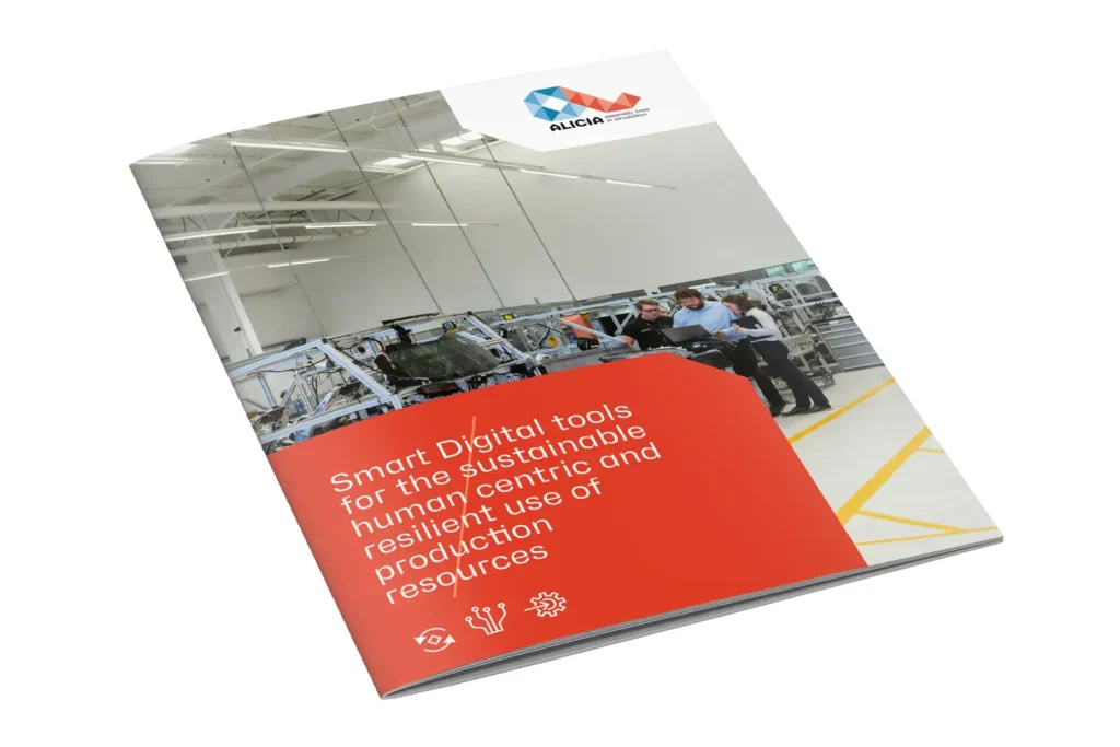
The brand book documents the design elements that were developed and illustrates how a comprehensive corporate design manual brings together colors, typography, imagery, and graphic language for future use.

Your contact person for this project
Christoph Ehlers
Graduate in Communication Design (University of Applied Sciences)